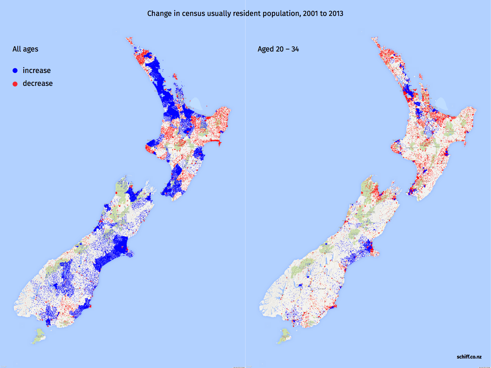
First, the national picture. Total population increased in all of the major cities, most smaller centres, and many rural areas too. In comparison the increase in young population is more concentrated on urban centres.
Click here for the larger version
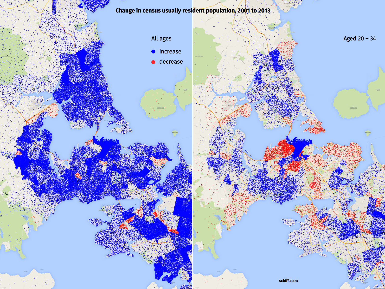
In the Auckland region, total population increased in almost all areas. The changes in young adult population are very different - a big increase in the CBD but reductions in many areas surrounding the CBD, and growth in outlying areas. I would hypothesise that this reflects housing costs more than anything.
Click here for the larger version
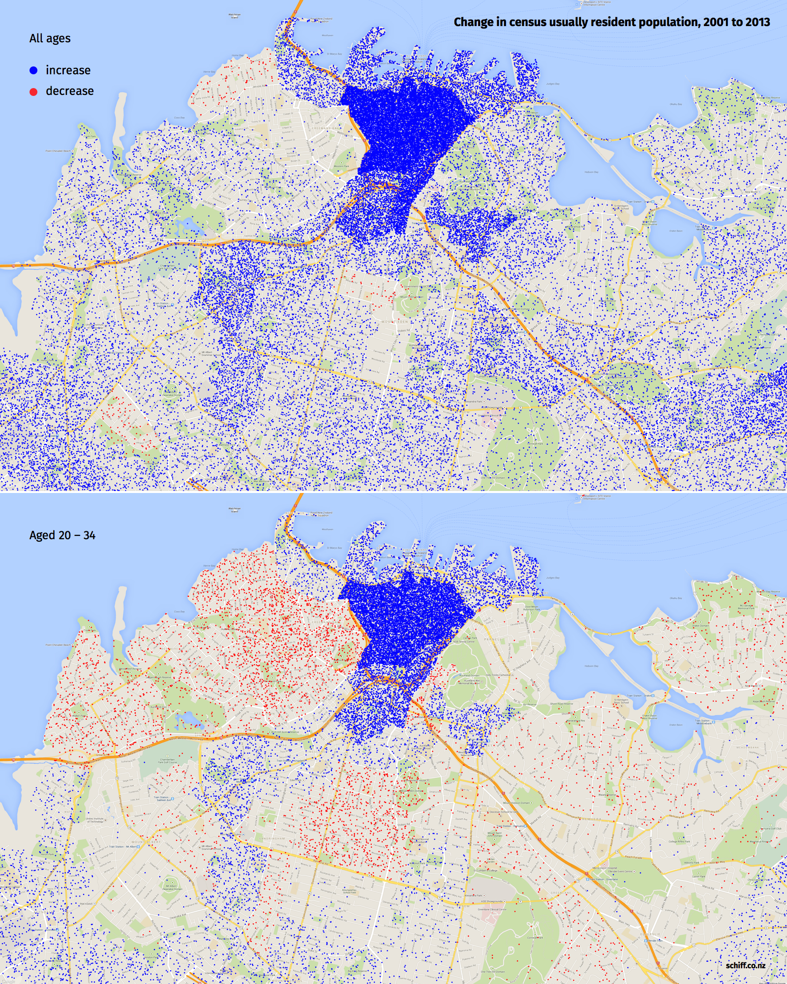
The areas just to the west of the CBD (Freeman's Bay, Ponsonby, etc) are especially interesting. The total population in these areas grew very little between 2001 and 2013, while the young adult population reduced significantly.
Click here for the larger version
I'd like to turn the data behind these pictures into an interactive map and include other age groups also. If anyone would like to help with that or wants the data, let me know.